Mother’s Day Canvas designs
We have now added a range of Canvas templates to our download page, so now it’s even more easy for you to get started. You will find added colour swatches and fonts styles in each of our downloads.
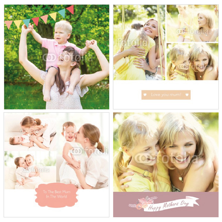
With Mother’s Day round the corner we are looking for designs that reflect this day. We want to see designs with photo holders, nice colour palette and all the girly/mummy elements you can think of. Take a look at the image to see some of the Mothers Day Canvases that have been designed already.
View our Downloads page to start downloading our templates and also check out the Advance Template Guide to learn more on how to create great designs that will sell!
Get Designing!
Upload your folded leaflet designs!
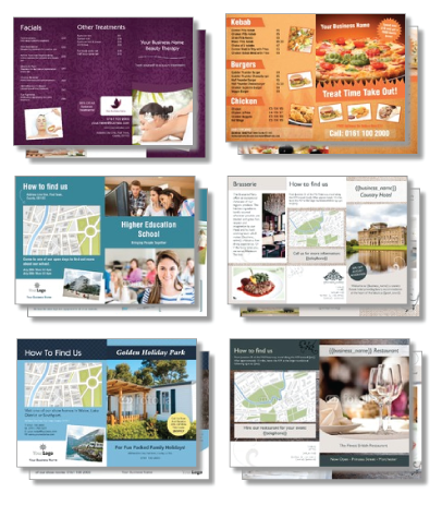
We have now added a range of folded leaflet templates to our download page, so now it’s even more easy for you to get started. Download a blank canvas template or use one of our basic or advance templates to inspire you! You will find added colour swatches, fonts and a place holder logo image in each of our downloads.
The industries we would like to extend are:
Hair and Beauty Price Lists
Driving Schools
Estate Agents
Insurance Companies
Taxi Services
Bed & Breakfast
Golf Courses
Leisure Centres
Nurseries
Earn royalties on industries you have already designed for by adding folded leaflets to your existing collections!
View our Downloads page to start downloading our templates and also check out the Advance Template Guide to learn more on how to create great designs that will sell!
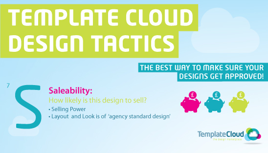
S is for Saleability: How likely is this design to sell?
Selling power (AIDA)
Customers want to buy promotional material that will be effective, so making your designs have the correct content for the industry you have chosen is very important. Here are four key points you need to remember when designing to give them the maximum selling power.
Attention
You want to grab people’s attention to your flyers, by making them stand out from the other industry designs. You can do this by adding a strong headline, which could consist of a question ‘Are you paying more than you should?â? or a special offer ‘Free Quotations in Januaryâ?, for example. Try and pick fonts that work well with the industry, for example a bold heading in a strong font would work well for a gym or bootcamp.
Interest
Now that you’ve got the customer looking at your designs, you want to keep them reading. Maintain their interest by adding in the benefits of using the industry. You can add in the main products and services, but avoid going into to much detail about all the features, remember the end users will be personalising this themselves, so using short, punchy text that grabs their attention is best!
Desire
Next you want to create a desire for the end user’s products or servicesâ?¦. The best way to make people take action is to offer them some kind of incentive. Make sure you add space for offers, create a sticker or coloured box so that they stand out from the rest of the design, the end user can then add their promotions and current deals.
Action
So you’ve made people want to use your end user’s business, but you now need to make it clear how they can contact them. The best way to do this is to leave space for a large ‘call to action’ on your designs, such as ‘Visit {{web_address}} now!â? or ‘Call now before it’s too late!â? using the auto fill phone number text {{telephone}}.
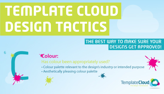
C is for Colour: Has colour been appropriately used?
Colour palette relevant to the design’s industry or intended purpose
Doing research on the industry you are designing for is a must. You need to know what works for the industry and what doesn’t so you get a design that is desired by the end user. For example, a cupcake maker would want a bright, colourful design, however this would not appeal to a car garage.
Remember that the design needs to be fully editable apart from the basic design layout you set, and the background colours, so this part of the design must be relevant. The end user can however change the colour of the text within the colour pallet you have selected. It’s a good idea to give as many options as possible for the end user, however remember to keep the colour harmony, you don’t want a lovely pink design with with neon green text!
Aesthetically pleasing colour palette
Appearance is everything when looking at a design, from the design features to the images, but one of the most important aspects is colour. Colour plays such an important role within design, it can sway thinking, change actions and create desire for what the design is advertising.
It’s a good idea to create colour harmony within your designs, this is something that is pleasing to the eye. It engages the viewer and it creates an sense of order, a balance in the visual experience. When something is not harmonious, it’s either boring or badly designed which will then divert the end user’s attention.
Oh the other hand if the design has too many colours, it can make the enduser not want to look at the design, this is because the human brain rejects over-stimulating information.
If you need help with colour schemes take a look at our Pinterest board for some inspiration. http://www.pinterest.com/templatecloud/colour-schemes/
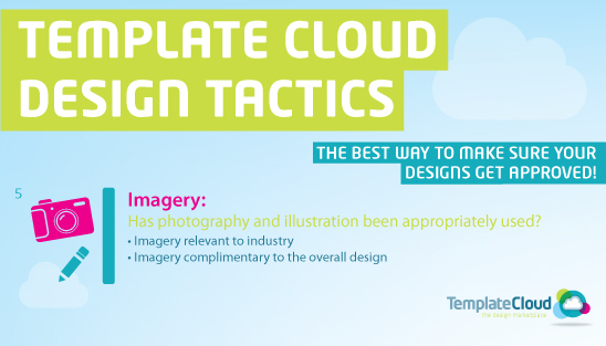
I is for Images: Has photography and illustration been appropriately used?
Imagery relevant to industry
Great images are what sell designs, so you want them to be relevant and work well with your designs. When you start a new template, it’s a good idea to first look at other images the industry you are design ing for, this will give you a good understanding of what works and what doesn’t.
If you want more than one image on your design, try and get them to be in the same theme as each other. It’s easy to do this when using Fotolia because there will be similar images below the image you are looking at that you can choose from. This makes the design look more professional and makes it more desirable to the end-user.
The other advantage of having industry specific images and illustrations in your designs is that it’s easy for the end-user to visualise how their business will work within the design. However, you might find that about 30% of end-users will actually use the photos that you have provided in the design as these may look more professional than their own, or they may not have any photos at all.
Imagery complimentary to the overall design
Once you have chosen an image for your design you can then start adding colours. If you are struggling with a colour pallet, it’s a good idea to take colour swatches from the images you have to make it match better with the design. The colour pallet of your design and images also needs to be relevant to the industry you are designing for, for example, you don’t want a pink beauty photo with a dark navy colour scheme. Keep the design in the same theme throughout to ensure that your design looks coherent and will sell.
T is for Targeted: Is it relevant for a specific industry or use?
Design, text and images are relevant to the industry sector
When designing a template for a specific industry it’s a lot easier if you imagine you are designing with a client in mind. You can then make sure you are keeping the design relevant by adding the correct content, copy and images. For example if you were designing for a specific industry like eye brow beauty, the design would be feminine and have lots of space for the end user’s photos of their work.
As said before, designs containing lots of photos sell, so you need to use them well within your design. For example, you might want to include some before and after photos of eyebrows from Fotolia so the end user will find the design even more appealing.
Using a big header gets the attention of the end user’s customers and it needs to be catchy and specific, for example, ‘Beautiful Brows in under 10 minutes!â?. This has now got their attention so you need to back it up with interesting copy. Include benefits and services like:
Waxing
Threading
Eyebrow tint
Brow Lightening
HD brows
You can then add desire to the design by adding offers that are relevant like ‘Book a brow wax in October and get FREE threading!â? Remember that there needs to be a call to action on the design too, you can do this by adding a large number and telling the customer to ‘Call Now!â? or ‘Don’t Miss Out, Call: {{telephone}} Todayâ?.
Covering all these points correctly will make your design sell in no time!
C is for content: Is the design fit for purpose?
Copy has been considered as part of the overall design
Our templates must have industry specific copy. This is so the end user can imagine using your design to promote their business, and also gives them confidence that their marketing will contain effective copy. When adding copy to your template it’s always a good idea to do some research on the industry you are designing for. To do this you can look online at other specific companies and see what offers and services they provide. For example, if you were designing a plumbing flyer ,you could add services like boiler servicing, repairs, power flushing, blocked sinks, leaks, burst pipes and fitted bathrooms.
Perfect spelling and grammar
All templates should have perfect spelling and grammar. Most end users keep the copy that is provided by the designer, so if there is a spelling mistake it can cause some big complaints. The simple answer is to always proof read and spell check your text before you upload.
Includes essential details
Every design needs to contain essential details within a design. ‘Active updates’ is a feature that will save time for the end user by automatically filling in certain details when the template loads. The use of ‘active updates’ is optional but we’d recommend you use them in your templates wherever possible, instead of using ‘placeholder’ text like ‘your name hereâ? or ‘your phone numberâ?. To add ‘active updates’ Simply replace ‘placeholder’ text with special field names with:
{{title}}
{{name}}
{{job_title}}
{{email}}
{{telephone}}
{{fax}}
{{mobile}}
{{web_address}}
{{business_name}}
{{address_1}}
{{address_2}}
{{post_town}}
{{county}}
{{country}}
{{postcode}}
When the template is loaded, the special fields are replaced with the user’s details from their account.A is for Adaptable: is the design fully editable?
Can images can be swapped
Using images in your designs is a big selling point and making them editable is even better. When adding images to your design always create a new layer to make sure it’s editable. You will need to add a white box the size of your design on the background layer, this is so that when the end user is using the design in the editor, they will be able to see the edges of the design.
Is the text fully editable (and uses copyfit)
Everyone wants to edit as much as they can on a design to make it their own. If you add a text box that is not editable you are restricting what the end user can do with the design, and therefore reducing the chance your design will sell.
Always add separate layers for text and name the layer c_, by doing this you are allowing the text box to use copyfit. Copyfit is clever tool in the editor that changes the font size to fit into the text box. This is a key point in the editor because the end user can add a much or as little text as they like without restrictions.
There is an appropriate variety of fonts and colours
The more paragraph styles you add to your design the better, this gives the end user more fonts to choose from. The same goes for colours, by adding s_ to your colour names means you are adding them to our system which will then show up in the editor. There is a easier way to get around individually adding colours and paragraph styles and that is by downloading one of our blank canvas templates from the TemplateCloud website, which come will many fonts and colours already included.
All logos can be swapped or removed
When designing a template it’s always a good idea to design 2 versions, one with a logo that you have designed for the flyer and one with an ‘upload your own’ logo holder. This gives the end user the option to pick a design that will work better for their business, depending on if they already have a logo or not. If they don’t want to use a logo at all, they can delete the whole logo box, or add an extra image instead.
Overall giving the end user more options and making all elements editable is the best way to make your design sell!
T is for Technical: Does the file work as a template?
The template generates correctly
Once you have made your design you will then need to upload it through the TemplateCloud website. Our clever system will then check all the elements in your file an make sure it’s correct to work as a template. If everything is correct it will list the fonts added and build the template automatically.
However if the template does not generate correctly there are a number of possibilities why this might happen:
â?¢ Have you embedded all of your images?
â?¢ Do you have more than one object on a single layer?
â?¢ Do any of your objects go off the art board?
â?¢ Have you added paragraph styles correctly?
â?¢ Are there any hidden characters in your text which our system does not support?
â?¢ Have you left enough ‘breathing space’ in the text boxes?
The template works correctly in the editor
When your file has been converted into a template we need to make sure everything works correctly in the editor, which is where the end user will be editing the design. You will also be able to see if there are any design issues within your template. The ones to look out for are:
â?¢ Font issues
â?¢ Text colours
â?¢ Are you v layers showing as you expect
The template can be saved
If your design has passed all of the the above we can then save the design. There can be hidden errors in the file that can cause the save button still not work but these are very rare.

