TemplateCloud Tactics

Get Your Template Building Tactics Right!

How do you increase the chances of your designs selling?

A question we get asked all the time by our Clouders. So we’ve spent some time looking at what sells and the characteristics of these designs.

What we’ve come up with is the TemplateCloud Tactics. Design by these simple rules and you may see your designs selling even more.

T: Targeted

Be Industry Specific.

Think carefully about the industry or sector you are designing for and spend time researching before starting your design.

For example:

  • Plumbers
  • Mechanics
  • Dentists
  • Beauty Salons
  • Dog groomers
  • Ironing services
  • Painters & Decorators
  • Accountants
  • Hairdressers
  • Electricians
  • Gardeners
  • Cake shops
  • Children’s entertainer
  • Solicitors
  • Builders
  • Estae agents

To name but a fewâ?¦.

All of these industries will have different messages they’ll want to convey. Consider what other elements they are will want to include such as photo examples of their work, list of services or industry accreditations. Your research should also look at what advantages they may offer over competitors and what colours, look and feel their collateral should communicate.

A: Adaptable

Make as many editable elements as possible. This allows greater flexibility for the end users allowing them to personalise their designs and tailor them to their business and local market. Unless there is a valid reason for making something fixed, don’t. Remember the new v_layer functionality allows you to create editable images underneath editable text and shapes. Read more about that here. If you’re not sure ask us.

C: Content driven

Create good content. Don’t just put a ‘Put text hereâ? layer. Think about what you would put if you were designing this for the client. Other than contact details, most end users only make minor text changes to existing copy within a design. End users are therefore more likely to buy a design if it uses good copy that’s relevant to the sector they work in. Add some relevant text or a key message as well as making sure the all-important heading for your design is pertinent and demands attention. The header will be the first thing end-users and their clients see and you only get one chance to make a good first impression.

T: Technically Sound

Get the basics first. Use the starter guide initially. Carefully read it and use the checklist on the back cover for every template you build to make sure they will work correctly once uploaded. Consider usability for the end user as well when setting text frames etc. to make sure your templates function with the greatest of ease for customers.

Keep checking our blog for new developments and features you can use in your templates, our systems are constantly updating and evolving to give you greater flexibility with your designs. Once you’ve mastered the basics, have a look at the Advanced Guide for more cool stuff you can do.

I: Image based

Our most popular designs centre around one or two large images – big images sell! So using an image as the focus of your design will appeal to end-users. You can use your own image or choose one from our TemplateCloud Image Library, the end-user can then choose to use your suggested image or replace it with their own image. Read more about how to use the TemplateCloud Image Library here or in our Template Creation Guide.

Remember you can now add editable text over an editable image or use shaped masks by mastering v_layers. Read more about that here. If you’re not sure, ask us.

C: Colourful

Your design will go head to head with hundreds of other designs on-screen, and the more colourful it is, the more likely it is to draw attention. Think about colours which compliment the industry you are designing for such as relaxing greens and purples for a spa.

Contrasting colours make important details stand out and can help make promotions and phone numbers jump off the page. Play carefully however, there’s a thin line between colour contrast and colour clashingâ?¦

S: Selling power

If you follow the above formula, your template should have a greater selling power for both you and any end user who purchases your design. But to really boost the likelihood of a sale, your design needs to follow a basic marketing principle called A.I.D.A. Run all your copy through this simple magic formula below to ensure your designs get a higher response. This formula is a great tool for writing powerful sales letters and killer copy:

Attention

Attract your reader’s attention with an exciting headline. Make them intrigued, just by reading it. Either reveal or conceal a common interest. For example:

‘How to Make Yourself Irresistible to Ladiesâ?

‘Want to Retire at 50?â?

‘Don’t Make These Common House-Buying Mistakesâ?

Interest

Evoke interest from your potential customer by telling them multiple, life-enhancing benefits. Steer away from just listing features. Use simple, short sentences and talk to them as if they’re sitting next to you.

Desire

Make them want it. Make it irresistible. Give them guarantees of their money back. Or extra special bonuses or discounts. Don’t forget to state the urgency – make your offer timebound. You could try ‘Order within 7 days and get this free pen set. If you’re not 100% satisfied, we’ll refund you in full.â? A good deal makes something more enticing but of course make it editable so end-users can tailor it to their needs and business offering.

Action

Tell them what to do! You’d be amazed how much sales literature misses the vital step. Don’t assume people who see your design will know what to do, make it clear what the next step is and make it stand out. Point them to the sales process  and get them to ‘call for a no-obligation quoteâ? or ‘Call us to place your orderâ?.

So, there it is. Stick this on your wall, engrave it on your pen, write it on your monitor – whatever you do, just don’t forget A.I.D.A. It’ll make you a better writer.


 

How to use stock images in your designs

How to use stock images

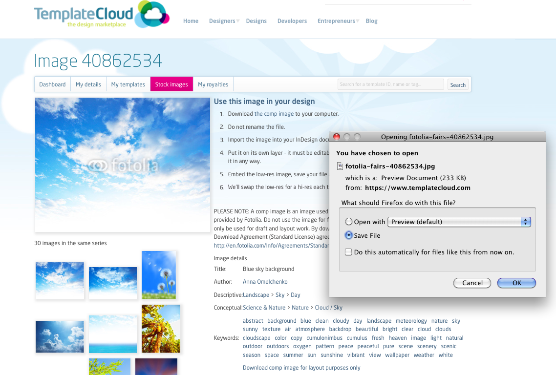
To use one of our images go to the Stock Images tab in your TemplateCloud account. Search for the content you wish to use and once you’ve selected your image you can download a low res, watermarked  ‘comp’ image free of charge (see below image). Place the image as required in your design and embed it as usual (read more about embedding images here).

These images can only be used as editable images and cannot be placed on the -Background layer. The images are named in a special way so don’t rename them and do not modify the image in any way.

We’ll replace it with the high res image when your template is used by a customer on one of our retail partner websites.

To watch an onscreen demonstration of this process, watch the How to Use Stock Images in Your Designs video.


How to use images in your designs

How to use images in your designs

For all images you use in your designs, whether they are editable and background images, they must be:

  • High resolution (minimum of 300dpi)
  • CMYK TIFFs or JPEGs (if saving as JPEG’s use the ‘Maximum’ quality setting to preserve resolution).
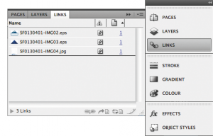
  • Embedded within your document (see right image below)
  • EPS files can be used on the background layer ONLY.

How to make images and logos editable

Only raster or bitmap images (TIFFs / JPEGs) can be used as editable objects in your design. Also make sure:

  • ALL vector elements are on the -Background layer (including vector logos or imported EPS files)
  • All editable images and logos are on their own layer
  • You have used NO effects on your image except for rotation or solid line frames. All other effects are forbidden on editable objects
  • Whilst you are getting used to producing editable designs, ensure all image frames are rectangular so no circles, stars or other fancy shapes. At a later stage, there are more cool things you can do with images in your design, read this post for more information when you are ready. You can use any shape you like on the -Background layer

Where are the images from?

Images you use within your design must be either:

  • Your own
  • Licensed for use within a web-to-print environment
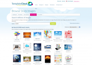
  • Images from our TemplateCloud Image LibraryOur image library is provided by Fotolia and features millions of images ready for you to use in your designs (see left image below).

To see an onscreen demonstration of placing images in templates, watch the How to Use Images in Your Designs video.


How to upload your designs

How to upload your designs

To upload your design, follow the below steps:

  • Make sure you have saved your file as an InDesign Template (.indt file extension).
  • Sign in to your TemplateCloud account and go to ‘Create New Template’.
  • Give your design a title and to select the size and specification of your file (ie. is it single or double sided).
  • Set your royalty and choose whether you would like it to increase with each sale or stay at a fixed rate. We usually recommend a royalty based on the size of your file and how many Fotolia images you have used, be careful not to set your royalty too high as this could prevent it from selling very well.
  • Upload you file and build your template. You will be prompted to replace any missing fonts at this stage with fonts from the Linotype library (see this post for more information on fonts you can use in your designs).
  • Test your template and make sure it works as you expect for the end client before saving it to proceed to the next step.
  • Tag your template as appropriate using tags from the list to help end clients search for your design. Make sure you add at least one tag from the Industry Type tab or add a tag if none are suitable.
  • Choose a maximum of three colours based on the main colours used in your design. Again this is to help end users when searching for designs of a particular colour.
  • Read and accept our Terms and Conditions to submit your design for approval.

You can view all of your designs from your dashboard which will allow you to see when your design has been approved and uploaded for sale.

Watch the Video: How to upload your design to TemplateCloud for more information.

How to download template files to build your designs

How to download template files to build your designs

To make sure you get the size of your document correct with the correct bleed and colour settings, we recommend downloading one of our template files. You can view the list of the different sizes here .

In our template files you will find:

  • Our full colour chart ready for use (all colours must be Process CMYK, no spot colours, tints or gradients)
  • A list of Active Updates
  • A placeholder logo

To see an onscreen demonstration of this process, watch the How to Download Template Files to Build Your Designs video.


How to use colour swatches in your designs

How to use colour swatches in your designs

To add a colour choice for the end user to use, add ‘s_â? to the colour name in the swatches panel.

You need to make sure that all the font colours you use in your document are labelled this way so that they display properly in the editor. All colours you use must be Process CMYK, no spot colours, tints or gradients as these will not view or print correctly once they have been edited.

To help you get your colours right, In our template files you will find our full colour chart ready for use with over 150 different swatches. You can download our templates here .

To see an onscreen demonstration of this process, watch the How to Use Colour Swatches in Your Designs video.

How to use Active Updates in your designs

How to use Active Updates in your designs


Using Active Updates in your designs means that your templates will be automatically pre-filled with an end-user’s contact details when they are editing your design. This helps to save them time and to better visualise how your design will work for them which could help to get you more design sales.

  • {{name}} First name & surname
  • {{job_title}} Position or job title
  • {{email}} Email address
  • {telephone}} Telephone number
  • {{fax}} Fax number
  • {{mobile}} Mobile number
  • {web_address}} Website
  • {{business_name}} Business name
  • {{address_1}} 1st line of address
  • {{address_2}} 2nd line of address
  • {{post_town}} 3rd line of address
  • {{county}} 4th line of address
  • {{postcode}} Postcode

To use Active Updates, use the field names below in your document instead of ‘placeholder’ text so that the design automatically pre-fills with the user’s details when they open it in our editor. This list of Active Updates is also in all of our template files ready for you to use, download one of our templates here .

To see an onscreen demonstration of using Active Updates, watch the How to Use Active Updates in Your Designs video.

How to use text in your designs

How to use text in your designs

Non-editable text

On the -Background layer you can use any font you like, just ensure all fixed text is on the lowest -Background layer and converted to outlines.

Editable text

A special ‘server’ font license is required for editing templates. We’ve bought this license for over 1,000 fonts from Linotype which you will need to use for editable areas. You can view or download a full list of this library here.

If you don’t have the exact font on your system you can choose a font with the same name. You will then be prompted to replace it with the Linotype version when building your template via TemplateCloud. For example, use any Frutiger Roman you already have and substitute it with Frutiger LT Pro 55 Roman from the Linotype Originals Library when uploading.

We can only substitute a font if there is an equivalent in the Linotype Originals 2.0 Library. So don’t use a font like Meta – find something similar from the library.

All editable fonts need to be set as a paragraph style in InDesign and named with their font name so they are identifiable. This includes any non-Linotype fonts you intend to replace at the upload stage.

Editable text cannot use special effects and requires certain settings to be applied in InDesign. Read through the list below carefully to make sure you respect all of the editable text requirements:

  • Don’t outline text (don’t convert it to paths).
  • Don’t use ‘Adobe Paragraph Composer’ justification – set to ‘Adobe Single Line Composer’ instead.
  • Don’t use ‘optical’ kerning (use ‘metrics’ instead).
  • Don’t use tracking (tracking should be set to ’0′).
  • Don’t scale, skew, compress, squash or expand.
  • Don’t use any special character effects such as all caps, small caps, superscript,subscript, underline, baseline shift, strike through, ‘forced’ bold, ‘forced’ italic or outlined.
  • Don’t use paragraph hyphenation.
  • Don’t use soft returns.
  • You can’t use text attached to paths.
  • Multi-column or linked (threaded) text frames aren’t allowed.
  • Tables, bullets and tabs aren’t supported.
  • Don’t use inset spacing (padding).
  • Avoid Text Wrap.
  • Don’t rotate text within a text frame (although its fine to rotate the whole text frame).
  • Don’t use non-rectangular text frames.
  • Don’t use tint swatches or gradients swatches.

Setting your text frame

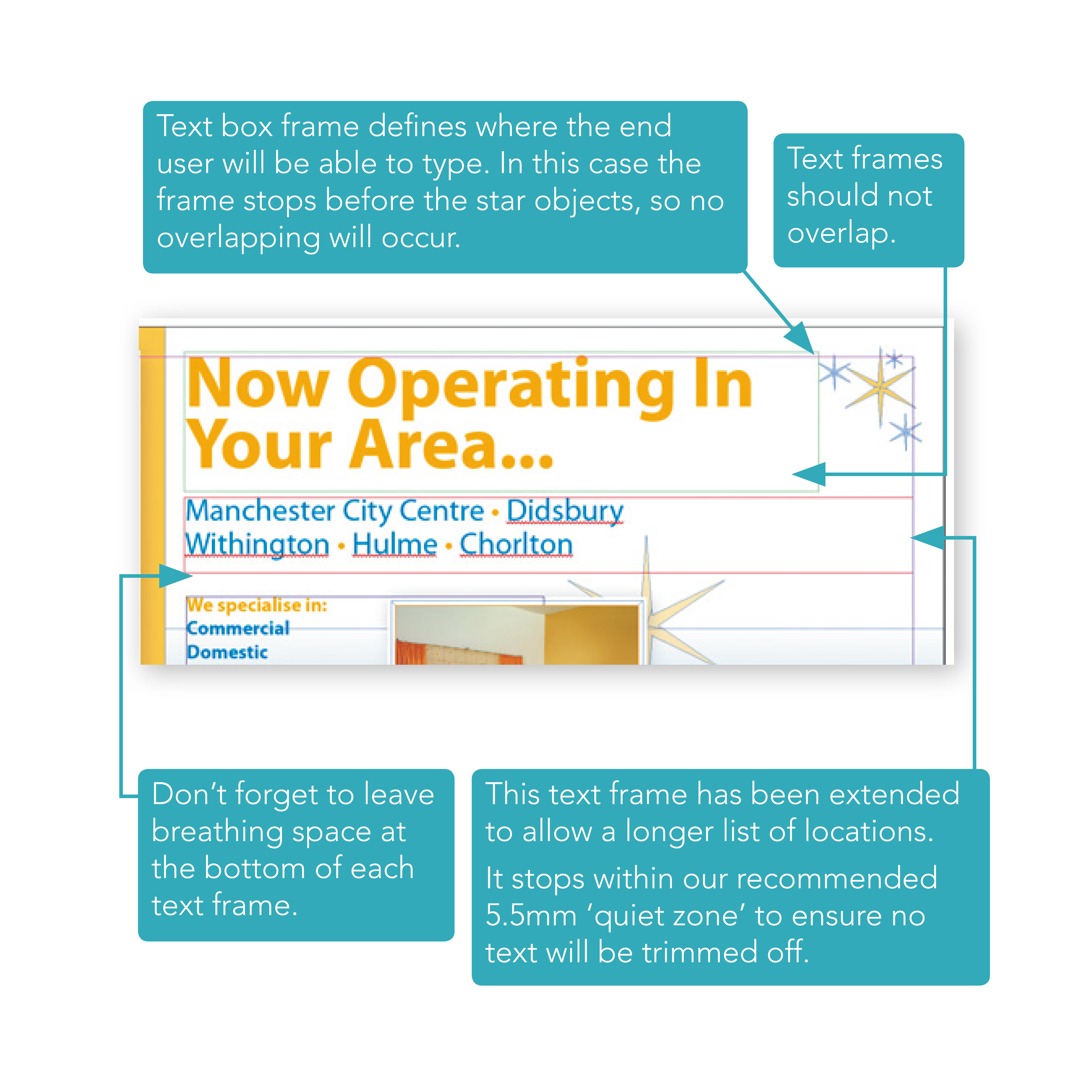
Define your text frame so the user has as much room as they need to fit in the text they want to type (see the example in the below image). Be sure to set the end of the text box carefully so it doesn’t run over important design elements or run off the edge of the page.

Avoid overlapping editable text frames or images as it makes it difficult for the user to pick items to edit. All text boxes should be rectangular.

Set some breathing space

Expand the bottom of your text frame by around 25% of the height of the font. This ‘breathing space’ allows the editor to display descending characters.

To see an onscreen demonstration of this process, watch the How to Use Text in Your Templates video.

How to use logos in your designs

How to use logos in your designs

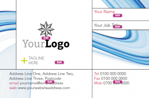
Some businesses will already have a logo, some won’t.Placeholder logos are embedded in all of our starter templates.

Position this samplelogo.jpg on your document on its own layer, at a suitable size wherever the client’s logo will be placed on your design (see below left image). Make sure you embed the samplelogo.jpg in your InDesign file as you would with any other images, see this post for more instructions.

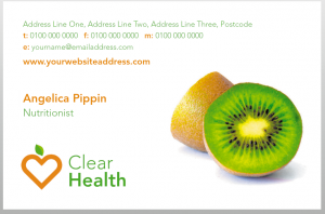
Instant logos consist of a graphical device together with some styled text, so that it looks like a logo (see below right image).

The user simply changes their business name and they’ve got an ‘Instant Logo’.

To see an onscreen demonstration of how to put placeholder logos in your design, watch the How to Use Logos in Your Designs video video.

How to make editable layers in your designs

How to make editable layers in your designs

Our template technology uses the layer information from InDesign to figure out how your template should work. The way you name your layer – and what you put on it – tells our software how it should behave and which rules to apply.

How to make things fixed

The background layer is home to all the fixed, non-editable objects in your document. Most InDesign features and effects are supported on the background layer except for Text Wrap. Make sure all text, graphic and image elements which will not be editable are on ONE background layer.

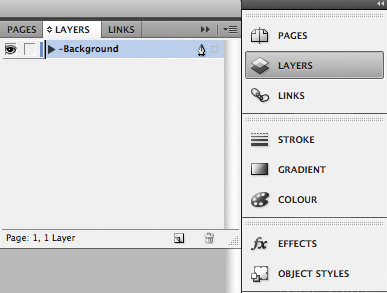
To turn an existing layer into the background layer just add a hyphen prefix ‘-â? to the layer name (e.g. ‘Background, see right image below).

The ‘Background layer should be the lowest stacking layer within the ‘Layers’ palette, so that objects on the ‘Background layer do not obstruct any editable objects.

How to make things editable

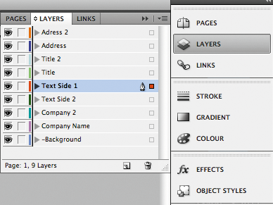
Each editable object needs to be on its own layer. To quickly move an object to its own layer, simply create a new layer for each one, then drag each object onto a separate layer, using the coloured indicators in the ‘Layers’ palette (see left image below).

To see an onscreen demonstration, watch the How to Make Editable Layers in Your Designs video.